Making Navigation Arrows More Visible for Additional Options
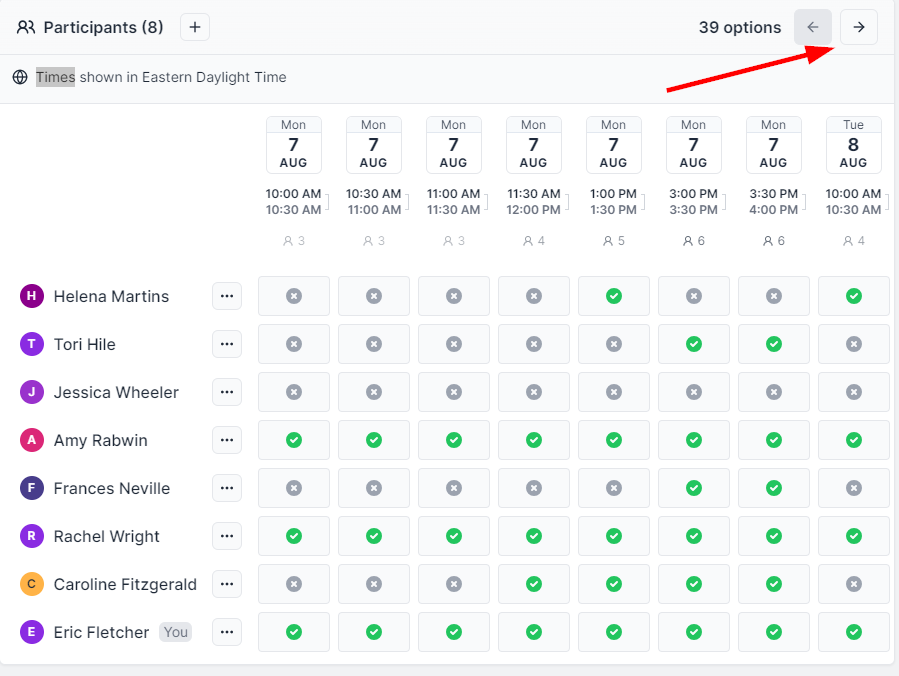
Just a small thing I've noticed: Sometimes poll respondents miss out on the additional date/time options because they don't see the arrows to toggle through. I've found myself sending friendly reminders along with a screenshot pointing out the arrows when respondents indicate availability for only the first panes worth of options (screenshot below that I sent earlier today to a respondent).
I'd like to see what others think about adding a little visual cue for first-time visitors to the poll? Maybe a subtle animation or some sort of highlighting could draw attention to the arrows? I feel this could be a neat touch to help promote everyone seeing all available options.
Please authenticate to join the conversation.
Closed
📥 Feedback
Almost 3 years ago
Eric Fletcher
Subscribe to post
Get notified by email when there are changes.
Closed
📥 Feedback
Almost 3 years ago
Eric Fletcher
Subscribe to post
Get notified by email when there are changes.